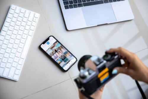
Our professional photography websites we provide have automatic iphone detection, automatically redirecting smartphone users to an html version of the site. This technology is pretty standard, and you should expect nothing less. However, our sites are smartphone optimized. In other words, if we detect a mobile phone browser, we change the way links and photos are displayed.
There is a huge difference between a 3.5″ screen and a 22″ monitor.
 Here is a screen shot taken from the portfolio page
 Here is the landing page, which shows a video that can launch full screen
Notice the links are all very easy to navigate and images naturally fill most of the screen.

Leave A Comment